 Atticus P's Chart
 There are a few times I miss using MS Excel in class and creating charts is one of them. Google Sheets does an adequate job of creating the basic types of charts, and does so pretty easily. But what is missing is all the fun ways to format those charts once they are created. The students created one of each type of chart we learned (column, pie, and line) based on both new spreadsheets and previous assignments.
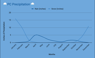
We also completed an assignment about interpreting charts. I created a slideshow that has several charts and tables for the students to find specific information in or interpret what the chart is supposed to show. Being able to create charts is great, but we also need to be able to figure out what a chart means.
We also completed an assignment about interpreting charts. I created a slideshow that has several charts and tables for the students to find specific information in or interpret what the chart is supposed to show. Being able to create charts is great, but we also need to be able to figure out what a chart means.
 RSS Feed
